17
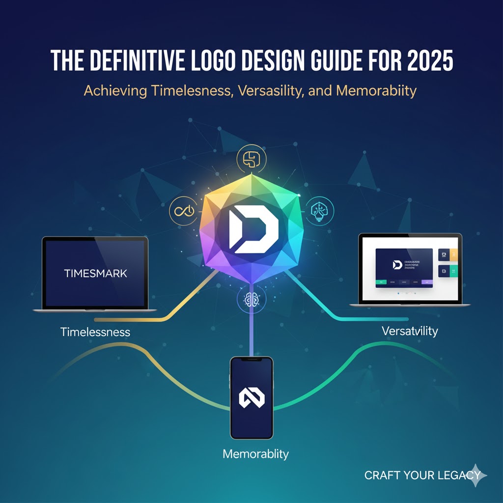
The Definitive Logo Design Guide for 2025: Achieving Timelessness, Versatility, and Memorability
Master modern logo design in 2025 with this definitive guide—learn how to create timeless, versatile, and memorable logos that elevate brand identity and impact.
In the modern digital landscape, a logo is no longer a static identifier; it is a dynamic asset that functions across countless digital and physical environments, from massive billboards to tiny 16-pixel favicons. For any brand seeking relevance and longevity, the logo must be a masterwork of strategic design, blending timeless principles with the demands of an increasingly complex, animated, and dark-mode-centric world.
This comprehensive guide condenses the entirety of contemporary logo design theory and practice into a focused strategy for 2025. It reveals how the four golden rules of design have evolved, explores the foundational role of brand research and shape psychology, and outlines the critical testing procedures necessary to ensure a logo’s effectiveness in any medium. Mastery of these concepts ensures a logo communicates clearly, remains functional across all mediums, and builds enduring brand power.
The Four Golden Rules: Reimagined for the Digital Era
The fundamental principles of effective logo design have endured for decades, but their application has been radically redefined by the requirements of modern digital branding, motion graphics, and personalized user interfaces.
1. Simplicity: The Core of Identity
Simplicity remains the linchpin of an effective logo. Iconic brands like Mastercard and Nike demonstrate that simplicity is not merely minimalism; it is a distillation of identity. A simple logo removes excess noise, but must never dilute the brand’s core meaning.
- The Identity Test: A common pitfall in modern design is achieving a level of minimalism so generic that the logo could belong to five different brands. To combat this, designers must ensure their logo possesses a unique visual signature.
- The Recognition Filter: A simple, quick test for effectiveness is to remove the brand name from the logo. If the core symbol—the swoosh, the intersecting circles—is still instantly recognizable and memorable, the design has achieved its goal. The exception remains 100% typographic logos, where the wordmark itself is the primary visual asset. Minimalism should remove excess, not identity.
2. Versatility: Adapting to Dynamic Environments
The definition of versatility has exploded in 2025. A decade ago, designers worried about print and screen; today, the checklist is far more demanding.
- Beyond Flat Graphics: Logos must be designed with motion in mind. Dynamic logos, such as those used by Spotify, shift colors, animate, and interact with music visuals while retaining their core shape and structure. Designers must ask: How will this logo look in motion? Does the shape hold up when adapted for an animation sequence?
- UI Adaptability: The ubiquity of dark mode and personalized user interfaces demands logos that can instantly adapt to varying color contexts. The design process must include planning for adaptive color variations to ensure functionality and visual appeal across light and dark backgrounds.
3. Memorability: The Primacy of Shape and Color
In an age where consumers are bombarded by thousands of visual messages daily, making a logo memorable is a sophisticated challenge. The secret lies in understanding cognitive psychology: the human brain processes and remembers shapes and colors first, before registering fine details.
- The Shape Test: Before adding any details, texture, or effects, a strong logo must first function effectively as a simple shape. If the simple silhouette is forgettable, no amount of detail or visual flair will rescue it.
- Shape Psychology: The core shape must instantly communicate the brand’s intended personality (e.g., circles for friendliness, squares for reliability, triangles for dynamism). This instant, subconscious connection is the foundation of long-term memory.
4. Scalability: The Spectrum of Digital Display
The traditional concept of scalability—from a business card to a billboard—has been superseded by the micro-display challenges of digital devices. A logo must now function across a vast spectrum, from a large-format print to the smallest digital asset.
- The Multi-Format System: Successful modern logos, such as Instagram’s, employ a design system with multiple planned scales:
- Full Logo: The detailed version with the wordmark for large-scale use and branding collateral.
- Simplified Icon: A compact symbol (or monogram) for use as an app icon, social media avatar, or other small display areas.
- Stripped-Back Symbol (Favicon): A core visual element designed to function at the smallest possible size.
- The 16-Pixel Rule: A crucial technical benchmark for modern logos is the 16-pixel test. If the logo design becomes an unrecognizable, cluttered mess when scaled down to 16 pixels (the common favicon size), it is definitively too detailed and requires the creation of a simplified favicon version.
The Strategic Foundation: Research and Audience Deep Dive
Before any sketch is made, a designer must execute a rigorous strategic foundation rooted in deep brand and audience understanding. Design choices must be driven by research, not fleeting trends.
Understanding Brand Identity and Emotion
The logo must be a precise reflection of the brand’s essence, evoking specific emotions and communicating its unique value proposition.
- Evoking Emotion: A luxury watch brand, for example, must evoke feelings of prestige, heritage, and exclusivity. The appropriate design language here might involve engraved serif lettering and deep, rich color palettes that reflect tradition and class.
- Communicating Vision: Conversely, a modern tech startup needs to feel bold, innovative, and disruptive. This demands a futuristic, clean geometric sans-serif typeface and a high-energy, vibrant color palette.
- The Uniqueness Factor: Designers must consistently ask: What makes this brand unique? What emotion must the logo evoke? The answers dictate every subsequent design decision, from typeface selection to the geometry of the symbol.
Identifying the Target Audience: The Core Driver
A common and critical design error is allowing the client's personal preference to overshadow the needs of the target audience. The audience, not the client, must entirely define the design choices. A high-end investment firm and a Gen Z fashion brand cannot—and should not—share the same design language.
- Audience Values and Touchpoints: Designers must analyze: Who is the brand targeting? What do they value? Where do they interact with the brand?
- The Language of Trust vs. Disruption:
- High-End Investment Firm: Requires a logo that looks trustworthy, established, and professional. This typically translates to classic serif typefaces, deep blues, and perhaps metallic accents that convey stability.
- Gen Z Fashion Brand: Requires a logo that is bold, experimental, and expressive. This could involve a dynamic, handwritten typeface, asymmetrical shapes, and a vibrant color scheme to feel unique and connected to the cultural moment.
The bottom line is clear: Every audience requires a different kind of visual language. Expert logo designers fully internalize this research-driven mandate.
The Psychology of Form: Shape, Color, and Typography
The components of a logo are not merely decoration; they are meticulously selected psychological tools that affect how the consumer feels about a brand.
Shape Psychology: The Subconscious Message
Shape is the fundamental element of memorability and emotion in logo design. The strategic use of geometry dictates the subconscious feelings evoked by the brand:
- Circles: Convey friendliness, community, and approachability. Think of continuous motion and soft, organic forms.
- Squares: Suggest reliability, structure, and professionalism. These forms are often used to communicate stability and trust.
- Triangles: Impart dynamism, innovation, and motion. When slanted or combined with angular lines, they strongly suggest forward movement, technology, and sport.
The trick is to identify the emotional core and personality of the target audience and match the logo's geometry to that psychology. Just as one buys a tailored gift based on the recipient’s known interests, the logo's shape must be tailored to the audience's expected personality.
Color Palette and Inversion Testing
The right color palette must always be derived from the brand’s message, identity, and target audience, not from current trends.
- Emotional Resonance: A luxury brand requires deep, rich tones (e.g., matte black, deep burgundy, gold) to communicate exclusivity, while a health and wellness brand might require greens and soft blues to evoke calm and natural energy.
- Functionality Over Aesthetics: A critical step in the design process is Grayscale and Inverted Color Testing. The logo must be tested in pure black and white and then with its colors inverted (for dark mode). This rigorous testing reveals whether the logo relies too heavily on color for its recognition, or whether it possesses a strong enough form and shape to be identifiable in any monochromatic or reversed-color context.
Typography: Reinforcing Personality and Legibility
The selected typeface is arguably the single most powerful tool for reinforcing the brand’s personality and aligning with audience expectations.
- Matching the Voice: The typeface must align with the brand’s voice, whether that voice is formal, friendly, bold, or refined. A geometric sans-serif (e.g., minimalist, highly legible) may be perfect for an innovative tech company, while an engraved serif (e.g., traditional, structured) may be required for a heritage financial institution, conveying tradition and trust.
- The Legibility Checklist: Designers must verify key considerations:
- Is the typeface legible across all sizes, from a website header to a tiny app icon?
- Does the typeface remain strong even when adjusted for weight and tracking (spacing)?
- Does the overall type style match the audience’s expectations and the brand’s strategic positioning?
A well-chosen typeface and strategic color scheme ensure the logo communicates clearly and consistently, reinforcing the foundational research.
The Validation Gauntlet: Three Essential Logo Tests
Once the logo is designed, it must be subjected to a final, rigorous round of real-world testing to validate its efficacy before launch.
1. The Blur Test (Simplicity and Form)
A strong logo should remain recognizable even when its fine details are obscured.
- Procedure: Apply a blur filter (such as a Gaussian blur) to the logo.
- Assessment: If the core shape and form are still recognizable—the essence of the Nike Swoosh remains visible even when heavily blurred—the logo is successful, proving it is not overly reliant on details. If the design collapses into an unrecognizable blob, the shape is too weak or too complex.
2. The Five-Second Recall Test (Memorability)
This test directly measures the logo's memorability and its ability to create a lasting mental impression.
- Procedure: Show a handful of test subjects the logo for a maximum of five seconds. Immediately afterward, ask them to describe it or, ideally, draw it from memory.
- Assessment: If the subjects cannot accurately recall or sketch the core shape and color, the logo is not memorable enough and requires simplification or a more distinct visual hook.
3. The Scalability Test (Versatility and Functionality)
This test validates the logo's functionality at the micro-scale required by modern digital platforms.
- Procedure: Scale the logo down to extreme sizes, including the benchmark 16 pixels (for the favicon) and common 40x40 pixel sizes (for social media avatars and UI elements).
- Assessment: If the full logo wordmark becomes an unreadable mess, the designer must immediately create a favicon-simplified version. Successful brands, such as Airbnb, utilize a simplified symbol (the Bélo symbol) without the wordmark for tiny sizes, ensuring the brand remains distinct and recognizable even when visual space is severely constrained.
Conclusion: Designing for the Future
In 2025, logo design is a specialized discipline that integrates brand strategy, cognitive psychology, and complex digital adaptability. The days of creating a single, static graphic are over. Success demands a comprehensive design system that includes multiple scalable formats, adaptive color palettes for dark mode, and a core visual identity that can survive the rigorous blur, recall, and 16-pixel tests.
By embracing the evolved golden rules—prioritizing simplicity over excessive detail, ensuring motion and dark mode versatility, creating memorable shapes, and designing with micro-scale functionality in mind—designers can craft logos that not only capture attention today but also build resilient, enduring brand equity in the dynamic digital landscape of the future. The definitive logo is one that is strategically designed to communicate, adapt, and remain instantly recognizable across the entire spectrum of consumer touchpoints.
Additional Educational Resources (External Links)
- For those interested in delving deeper into the processes and advanced techniques of modern branding and visual identity, comprehensive educational materials can be found at specialized design resources (e.g., logodesignprocess.com or major design education platforms).
- Further reading on cognitive science and its application to brand memorability is highly recommended for all serious designers.
Contact
Missing something?
Feel free to request missing tools or give some feedback using our contact form.
Contact Us