09
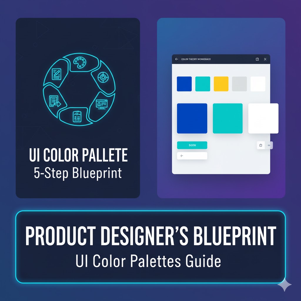
The Product Designer's Blueprint: A 5-Step Process for Creating Cohesive UI Color Palettes
As a Product Designer, mastering the art and science of color is fundamental to building intuitive and aesthetically pleasing user interfaces. A well-crafted UI color palette is the foundation of your digital product's visual identity, influencing everything from user perception to conversion rates. However, color work often feels subjective and overwhelming.
As a Product Designer, mastering the art and science of color is fundamental to building intuitive and aesthetically pleasing user interfaces. A well-crafted UI color palette is the foundation of your digital product's visual identity, influencing everything from user perception to conversion rates. However, color work often feels subjective and overwhelming.
I've developed an efficient and repeatable 5-step process that takes the guesswork out of color selection, ensuring your palette is harmonious, accessible, and functional for any interface. This comprehensive guide details my method and provides essential tips for working with color effectively.
Step 1: The Essential Categories of UI Color
Before diving into the design process, it's crucial to understand the three distinct roles colors play in a typical user interface. Every color in your UI, from the primary buttons to the background washes, will fall into one of these categories:
1. Brand Colors (The Identity)
These are the colors that define your product's core identity and mood.
- Source: These are typically provided by the business or marketing team as part of the overall branding package. You'll usually work with just one or two primary brand colors.
- Function: They provide splashes of color and establish the overall feel of the site. A classic example is Facebook's signature blue, which maintains a consistent brand presence even though the app is primarily gray.
- Usage: Primary calls-to-action (CTAs), buttons, links, key navigation elements, and important icons.
2. Supporting Colors (The Communicators)
These colors are used in key, distinct places to grab the user's attention or communicate a specific status or message. They are used less frequently than brand or neutral colors.
- Function: To draw attention and communicate meaning without relying solely on text.
- Usage:
- Green for success messages or positive confirmations.
- Orange or Yellow for warnings or caution alerts.
- Red for errors, form validation failures, or dangerous actions.
- Blue (often different from the brand color) for neutral informational messages.
3. Neutrals (The Foundation)
Neutrals are the workhorses of any UI. They make up the majority of your application because virtually every interface element is a form of gray.
- Function: To provide contrast, structure, and readability. They create the backdrop against which your brand and supporting colors can shine.
- Usage: Text colors, backgrounds, card washes, border colors, dividers, and secondary/tertiary buttons.
Step 2: Finding a Starting Point
We don't start by picking a dozen colors; we start with one core color and systematically build the entire palette from it. This ensures consistency and cohesion.
The Brand Color as Your Base
In the vast majority of cases, your starting point will be your primary brand color. This color is usually the most fixed element, as it's often determined by corporate branding decisions that predate the UI design process. If you were building an application for a company with an established brand, that color (e.g., a specific purple or blue) is your anchor.
If You Need to Pick a Base Color
If you are designing for a new brand or don't have a starting color, you'll need to select a good middle color—the shade upon which all lighter and darker variations will be based.
- Rules of Thumb: Your base color should be a shade that would look appropriate as a primary button background. On a standard color picker, it often resides in the upper-right section (medium saturation, medium brightness).
- Inspiration Resources: If you need a spark of inspiration or a pre-vetted color combination, reliable online resources are invaluable. Two highly recommended starting points are Huemint (https://www.huemint.com/) and Color Hunt (https://colorhunt.co/).
Step 3: Switch to HSB for Finer Control (A Critical Tip)
Before proceeding, make a vital switch in your design tool. Most design software defaults to Hex or RGB color values, but when making a color palette, you should use HSB (Hue, Saturation, Brightness).
HSB provides a more understandable and predictable way to manipulate color, giving you the precise control needed in the following steps.
Step 4: Selecting Your Supporting Colors
Now that you have your base HSB values, you'll select your supporting colors—green, red, yellow/orange, and informational blue.
- The Cohesion Rule: The key to harmonious supporting colors is ensuring they feel like they "go along" with your brand color. If your brand color is highly saturated, but your supporting colors are desaturated, the UI can feel disjointed.
- The HSB Guide: To maintain cohesion, pay attention to your HSB numbers. Keep the Saturation and Brightness values for your supporting colors within a close range (I recommend within 5 to 10 points) of your primary brand color's S and B values. You can then adjust the Hue freely to find the specific color (e.g., shifting the Hue to the Green section of the wheel).
Step 5: Generating a Full Scale of Shades (The Arc Method)
A single "medium" color isn't enough for a dynamic UI; you need a range of shades for different contexts (e.g., a darker shade for hover states, a lighter shade for backgrounds). This step systematizes the creation of a 5-to-10 point color scale.
1. Lay Out the Scale
Create nine color blocks and label them with a hundreds scale from 100 to 900. Using the hundreds scale allows you to easily insert half-steps (like 50 or 950) later if needed. Place your already-chosen base color in the 500 spot.
2. The Secret Arc Method
The trick to generating a beautiful, functional, and visually balanced shade scale lies in understanding the Color Picker Arc.
- Imagine a line that starts at the top-left corner of the Color Picker (high brightness, low saturation/white) and goes to the bottom-right corner (low brightness, high saturation/darker, richer color), passing directly through your base 500 color.
- The Goal: You must pick all your remaining shades along this imaginary arc to ensure a smooth, natural transition from light to dark.
3. Anchor the Ends
Select your darkest and lightest shades first:
- Darkest Shade (900): Aim for a high saturation (around 90 to 100) and low brightness (around 20 to 30). This shade is often used for text or dark accents.
- Lightest Shade (100): Aim for a very low saturation (around 5 to 10) and high brightness (around 95 to 100). This shade is ideal for tinted backgrounds or alert component washes.
- Tip: Test the 900 shade against the 100 shade in a practical component like an alert box (900 for text, 100 for background) to ensure sufficient contrast right from the start.
4. Fill the Gaps
With the 100, 500, and 900 colors set, fill the remaining spots:
- 300 and 700: Pick the midpoint on the arc between 100 and 500 for the 300 shade, and the midpoint between 500 and 900 for the 700 shade.
- 100-900: Continue this process until your entire scale is complete.
5. Create Your Neutrals Scale
Follow the exact same process for your grays.
- Pick a Middle Gray (500): Start with a functional medium gray.
- Follow the Arc: The key difference here is that the curve of your arc will usually be closer to the center of the color picker for darker shades, as you are desaturating heavily to stay in the gray range. Keeping the Saturation low ensures your dark gray doesn't become a subtle, unwanted shade of blue or purple.
Final Review and Iteration: Testing and Refinement
Once you have generated full shade scales for your brand, supporting, and neutral colors, the fifth and final step is rigorous testing and refinement.
1. Visual Balance Check
Line up all your color scales (Brand, Success, Warning, Error, Neutral) side-by-side.
- The Squint Test: Squint your eyes or apply a blur filter to the layers. This abstracts the color, allowing you to focus purely on the perceived lightness value.
- The Alignment Goal: The line created by the shades (e.g., all the 300 shades in a row) should look visually level and cohesive. If one color's line looks "wiggly" (e.g., the yellow 200 looks much lighter than the blue 200), it indicates a lack of coherence. This means if a user swaps a yellow background for a blue background, the visual weight will feel unbalanced. Fix this by tweaking the saturation or brightness of the unbalanced shades.
2. Live UI Application and Accessibility
Plug the final colors into your actual UI designs and test them in context.
- Aesthetics and Cohesion: Do the colors feel aesthetically pleasing? Do they fit the brand's tone and mood?
- Functionality: Do you have all the variations you need for specific states (e.g., a disabled button, a dark mode text color)?
- Accessibility and Contrast: This is non-negotiable. Use color contrast checker tools (e.g., the built-in accessibility checkers in Figma/Sketch or external web tools) to ensure all text and interface elements meet the WCAG 2.1 standards for color contrast. For instance, your 900 text shade must have a high enough contrast ratio against your 100 background shade.
For example, if the green scale looks too vibrant or 'neon' compared to your other colors, slightly decrease the saturation across that entire scale until it sits in balance.
3. The Iteration Mindset
Don't be afraid to keep iterating, but follow this key principle: Tweak what you have instead of creating new shades.
- Stick to a Maximum: Try to maintain a scale of no more than 10 shades per color. Too many options (e.g., 70 different blues) leads to decision fatigue and inconsistent application across a product.
By adhering to these structured steps, you will transition from randomly picking colors to generating a balanced, cohesive, and fully functional UI color system, complete with all the necessary shades for diverse design requirements.
Advanced Insights and Next Steps
For those ready to dive deeper into the world of color systems and design handoff, there are resources available to further refine your process and toolkit.
- Field Guide to Color: To explore topics like automating the shading process, utilizing advanced color contrast tools for accessibility compliance, creating effective dark modes, and ensuring a seamless handoff to developers, a comprehensive product design resource can be invaluable.
- Color Inspiration and Tools: Look for tools that can help you with specific tasks, such as generating harmonious palettes or checking your contrast ratios against established accessibility guidelines.
- The Continuous Process: Remember that a color palette is a living document. Even after implementation, gather feedback and be open to small adjustments. The goal is to create a design system that is both beautiful and resilient.
Contact
Missing something?
Feel free to request missing tools or give some feedback using our contact form.
Contact Us