


Why is it that a simple graphic element—a particular style of typography, a unique color palette, or even a specific symbol—can immediately resonate with a target audience, creating an automatic sense of recognition and affinity? This phenomenon isn’t accidental; it’s the result of carefully constructed brand architecture built upon a consistent, compelling, and fully realized world or aesthetic.
If you are currently building a brand, launching new content, or executing any marketing campaign without a meticulously crafted mood board or vision board as your central reference point, you are, quite simply, guessing.
When leading a design team responsible for advertising that generated eight figures in annual revenue, our success was not based on luck or guesswork. It was the direct result of a fully crafted vision board that dictated the look, feel, and tone of our entire brand presence. This strategic tool eliminated ambiguity, ensured every touchpoint was cohesive, and accelerated our path to market dominance.
This guide will show you the exact process and tools used to create an effective mood board (sometimes called a vision board), transforming vague ideas into a clear, communicable vision. If your goal is to build something that people are genuinely obsessed with, the foundation must be a cohesive aesthetic.
The Foundation of Aesthetic Discovery: Tools for Finding the Vibe
The first step in building your brand’s world is gathering inspiration. You need platforms that act as idea engines, helping you to define the visual language of your brand.
Pinterest: The Ultimate Engine for Visual Vibes
For years, Pinterest has stood as the premier platform for sourcing visual inspiration, offering an unparalleled wealth of “vibes” for any aesthetic imaginable. It is an indispensable tool for the early stages of mood boarding.
If you are exploring ideas for text and typography, a quick search will immediately yield a cascade of recommendations. While your feed will naturally become tailored over time, even new users can quickly navigate to highly relevant content. For instance, searching for something specific like “Art Deco typography” or “Mid-century modern logo design” will produce a wealth of visual concepts.

The true genius of Pinterest lies in its powerful recommendation system, which helps you delve into deep, specific visual niches. When you find an image or advertisement that resonates—perhaps an old-school 1980s aesthetic or a beautifully executed piece of modern design—clicking on it immediately presents a curated collection of similar images.
Consider an example: you might encounter an ad that uses bold, classic typography and striking iconography. Clicking that piece will lead you to similar works that leverage these small, detailed elements to create a cohesive whole. By saving two seemingly different but stylistically related pieces—say, one with a nostalgic, film-like color grade and another with clean, modern lines but a similar typographical approach—you begin to build the raw material for a matching template or mood board.
This exploration often leads down creative rabbit holes, allowing you to continuously refine your search. While the results won’t always be perfect, the platform excels at maintaining the overall aesthetic quality. If you find your searches are too broad, the crucial keyword to refine your results is “aesthetics.” Typing in “Bali design aesthetics,” for instance, will deliver highly specific visuals, whether you are looking for poster designs, color palettes, or even interior design inspiration. Pinterest is the foundational platform recommended for establishing and defining your brand’s core aesthetic.
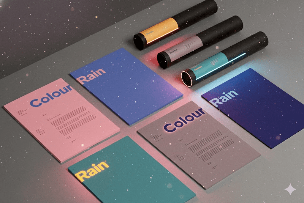
Cosmos: The Edge of Aesthetic Evolution
Beyond the established giants, newer platforms like Cosmos offer a fresh approach to mood boarding, often feeling like an aesthetic destination in itself due to its sophisticated design. Cosmos not only replicates the visual saving functionality of other platforms but adds the highly valuable layer of color-based search.
Imagine you are saving designs for a new product line or marketing campaign. You might have a board full of inspiring poster designs. If you find a specific image whose color scheme you admire, you can copy that design and use the platform’s search function to filter for similar designs that share that exact colorway.
This ability to search by color is powerful. It allows you to explore emerging trends, such as the resurgence of mid-century modern or the evolution of the Bauhaus aesthetic. These classic design revolutions are constantly being reinterpreted. By observing what is trending across design feeds, you can strategically combine old inspiration with modern sensibilities. The goal is to take classic elements that are still applicable today and apply them within a color scheme that is friendly to current aesthetics. You take inspiration from the past, connect it with a contemporary color palette, and save the resultant concepts onto your dedicated boards.
Intentional Consumption on Social Media: Instagram and TikTok
While Pinterest and Cosmos are dedicated inspiration tools, modern mood boarding must also leverage the massive creative libraries of platforms like Instagram and TikTok. These platforms are essential for understanding current trends, but they must be used intentionally to avoid the trap of “doom-scrolling.”


On Instagram, this intentionality means utilizing the Collections feature. Instead of passively liking content, you must actively save every piece of relevant visual information into a corresponding, categorized board. For a clothing brand, this might mean separate collections for “Motorcycle Shots,” “Surf Culture,” “Film Story Ads,” or “Surfboard Designs.” These collections become your portable visual resources, ready to be pulled into the next stage of synthesis. For example, a designer looking at surfboard designs might save various color schemes and eventually settle on a dominant palette, like red and dark brown, based on the accumulated visual evidence. The challenge here is the sheer volume of content; the key is separating the truly inspirational from the noise.
The same principle applies to TikTok. Its highly specialized algorithm can rapidly deliver content that is precisely tailored to your developing aesthetic—from dream travel destinations that define a desired lifestyle to detailed analyses of brand strategy shared by creative directors. By actively saving these clips and visuals into Collections on TikTok, you ensure that your visual references include not only static images but also dynamic movement, music, and overall atmosphere.
The ultimate purpose of all this saving and categorizing is to create a robust, easily referenceable vision board—a master document that synthesizes all the fragmented pieces of inspiration.
Synthesizing the Vision: The Mood Board Masterpiece
Once the raw inspiration is gathered from various sources, the next crucial step is synthesizing it into a single, cohesive mood board. While some professionals prefer tools like Figma or Illustrator, a highly accessible and rapid choice for most is Canva, specifically utilizing its powerful Whiteboard feature.
The Whiteboard feature provides an expansive, virtually limitless canvas—a giant workspace where all your ideas can coexist. This is critical because inspiration saved in separate folders or albums—such as a collection of hat designs in one place and clothing inspiration in another—cannot communicate with each other.
By assembling everything on one massive board, the entire vibe comes together:
- Holistic Assessment: You can place hat inspiration directly next to clothing concepts. For example, you might realize that a “loud” hat design necessitates a more minimalist or minimally labeled clothing piece to maintain balance.
- Visual Connectivity: You can see how different visual elements, graphics, and textual styles from disparate sources (like a piece of vintage typography and a modern photographic style) connect and interact.
This single-canvas approach allows you to quickly draft and brainstorm, moving elements around until the entire collection feels like a unified brand experience. While more advanced design work will require specialized tools, the Canva Whiteboard is exceptional for the initial, fluid stage of brainstorming and drafting.
The Three Pillars of a Cohesive Brand Aesthetic
The mood board itself is merely a collection of images until you apply a framework for analysis. To transition from a collection of “likes” to a functional brand guide, you must break down the visuals into three core elements: Color, Typography, and Visual Elements. These three pillars essentially define a brand’s vibe.
1. Color: Defining the Emotional Palette
The overall color palette defines the emotional and visual foundation of your brand. When all the collected imagery is laid out, a similar color scheme should naturally emerge. You need to analyze the following:
- Overall Color Palette/Scheme: Is the vibe generally filmic and old-school, bright and vibrant, muted and natural, or stark and minimalist? This broad scheme dictates the mood.
- Borrowing and Inspiration: Identify colors that stand out in the images you’ve collected. If you see a particularly appealing red on a piece of vintage apparel or a rich gold in a contemporary graphic, these are colors you can borrow.
- Tool-Assisted Selection: Tools like browser plugins with dropper tools allow you to sample a specific color from any image, giving you the precise hexadecimal or RGB code. While photos may not yield 100% perfect color values (optimal sampling should be done from digital designs), they provide an excellent starting point. If a specific gold from a graphic design piece fits the mood of your clothing or product concepts, you have successfully integrated a color that is visually cohesive.
This process culminates in a formal color palette guide for your mood board, detailing the primary, secondary, and accent colors that will be used for your branding, ensuring consistency across all visual assets and typography.
2. Typography: The Brand’s Voice
Typography is the visual voice of your brand. The fonts you choose communicate everything from your brand’s personality (e.g., authoritative, playful, nostalgic) to its desired era.
- Style Analysis: Look closely at the typography in the saved images. Does a brand pair a script font with a clean sans serif? Does it use thick, blocky 80s-inspired lettering, or thin, elegant serifs?
- Nostalgia and Trends: Many successful modern brands are capitalizing on a nostalgic kind of feel, such as the 80s aesthetic. You must determine if this style fits the mood board you are building.
- Font Identification: When you find a font you like, a powerful tool like MyFonts’ WhatTheFont is invaluable. You can take a screenshot of the text, upload it, and the tool will identify similar fonts, listing both free and commercial options. You should also check major libraries like Google Fonts or Adobe Fonts (if you have a subscription) as they often contain suitable alternatives that match the overall vibe.
The typography chosen must fit seamlessly with the color palette and overall mood. A playful, bubble font, for example, would clash instantly with a minimalist, high-end filmic color scheme.
3. Visual Elements: Motifs and Composition
Finally, you must analyze the design elements—the shapes, icons, and compositions that repeat across your saved inspirations. This is often the most subtle and powerful component of the brand world.
- Motif Identification: Look for recurring patterns. In high-end, upscale or “old money” aesthetics, you might notice motifs like a Roman crown, laurel leaves, specific crest shapes, or a consistent use of script combined with elegant, minimal wording. Even if the images come from different brands, the fact that they share these visual cues signifies a unified aesthetic trend you can tap into.
- Shape and Composition: Go back to your design boards (like the Cosmos example) and analyze how the graphics are laid out. Is the text often centered? How are elements spaced in relation to each other? Are there recurring shapes (geometric, organic, or abstract)? For instance, the mid-century modern revival often uses geometric, balanced designs inspired by the Bauhaus school.
- The Grid and Balance: A useful technique is to imagine a grid over the design. Where are the key text blocks positioned? How does the placement of a small icon affect the weight and balance of the whole graphic? This requires practice and involves creating test designs where you move things around to find what feels instinctively correct for your brand’s vibe.
By consciously noting these trends—from the use of gold accents to a specific type of leaf motif—you can consciously incorporate them into your own brand design, ensuring your final product speaks the same visual language as the successful brands you admire.
The Imperative of Intentionality
In summary, the transition from guesswork to creative certainty is paved by intentionality. A brand’s ability to create a “world” that automatically draws a certain audience is not magical; it is architectural. It is the result of a rigorous, multi-platform process that involves:
- Exploration: Using platforms like Pinterest and Cosmos to define the aesthetic and color palette.
- Collection: Intentionally saving relevant visuals and dynamics from social media (Instagram, TikTok) into categorized collections.
- Synthesis: Assembling all content onto a single, massive workspace (like a Canva Whiteboard) to see the full vision and connectivity.
- Analysis: Breaking down the collective visual into the three functional pillars of Color, Typography, and Visual Elements to create actionable design rules.
When this disciplined approach is followed, every piece of content, every ad, and every product released is an authentic expression of that singular vision, building a cohesive brand experience that commands recognition and inspires genuine obsession among its target demographic.
Conclusion: Building an Obsession, Not Just a Brand
The act of mood boarding is the critical, non-negotiable step in modern brand development. It transcends the superficial process of choosing a logo or picking random colors; it is the discipline of creating a coherent visual universe. In an attention economy saturated with fragmented content, audiences gravitate toward brands that feel whole, intentional, and deeply committed to a specific aesthetic.
The process detailed here—leveraging the exploratory power of visual search engines, the dynamism of social media collections, and the analytical synthesis of a digital whiteboard—provides a robust framework. It transforms the abstract concept of a “vibe” into quantifiable design elements: color codes, font choices, and recurring motifs.
By establishing this clear, detailed vision board, you equip your design, marketing, and content teams with a single, undeniable reference point. This eliminates internal debate, accelerates content production, and guarantees that every single piece of output contributes to the same overarching story. Ultimately, you stop guessing and start building a world that not only attracts your ideal audience but creates a loyalty that is closer to obsession. This strategic intentionality is the true key to future-proofing your business in the competitive digital landscape.