For decades, email marketing has been a game of frustrating compromises. Marketers have been trapped in a constant battle between creative vision and technical reality. You might have a brilliant concept for a visually stunning newsletter, but you’re immediately handcuffed by the clunky, restrictive drag-and-drop builder inside your email service provider (ESP). The alternative? Hiring an expensive developer to hand-code a custom HTML template, a process fraught with its own set of nightmarish complexities involving client compatibility, responsive design, and endless testing.
This “design-to-code” gap has meant that for most small businesses, bloggers, and even mid-sized marketing teams, beautiful email design has been an unattainable luxury. Emails have largely defaulted to “good enough”—a single-column layout, a few static images, and a blocky button. But what if that barrier was simply removed? What if you could use a world-class, intuitive design platform to build your email, and then simply export it to the platform of your choice?
This is precisely the problem Canva has set out to solve with its email design feature. This powerful addition to its creative suite aims to democratize email design, allowing anyone to create beautiful, clickable, and even animated email templates that can be used with any platform that accepts HTML.
This comprehensive guide will walk you through every aspect of this feature, moving beyond a simple “how-to” and into the strategic “why.” We’ll explore the design process, advanced customization, testing, and the critical steps for exporting your design and making it work in the real world.
Navigating the Canva Email Template Ecosystem
The moment you decide to create an email in Canva, you’re presented with two distinct paths. Your choice will largely depend on your confidence level and the clarity of your vision.
Path 1: The Blank Canvas
From the Canva homepage, you can click the “Email” icon to create a new, blank document. This opens a fresh Canva document, formatted for a standard email width (typically 600-640px). This path is best for professional designers or marketers who have a very specific, pre-designed wireframe in mind. You are in complete control, but you’re also responsible for building the entire structure, hierarchy, and flow from scratch.
Path 2: The Inspiration-Led Template Library
For the vast majority of users, the superior starting point is the template library. Instead of clicking the main “Email” icon, a more effective method is to navigate to the “Templates” section from the homepage and then select the “Email” category.
This approach gives you a bird’s-eye view of all available email templates, neatly categorized. You can browse designs for:
- Newsletters
- Promotional Announcements
- Event Invitations
- Welcome Emails
- Holiday Greetings
What makes this method so powerful is the ability to see complete, professional designs at a glance. You can find a layout that matches your content’s structure—perhaps a hero image, followed by a three-column block, and a final call-to-action. You can filter by “Free” and “Premium” templates, ensuring you find a starting point that fits your budget. This isn’t just about saving time; it’s about starting with a foundation that already incorporates sound design principles.
For this guide, we’ll select a free template to demonstrate the full range of customization available to every user.
A Deep Dive into the Customization Engine
Once you’ve selected your template, you’re in the familiar Canva editor, but with a few email-specific nuances. This is where you transform a generic template into a branded masterpiece. Let’s break down the key components you can customize.
1. Branding Basics: Text, Fonts, and Color
The first step is to align the template with your brand’s visual identity.
- Text: This is as simple as clicking on any text box and typing. You can adjust fonts, sizes, letter spacing, and alignment from the top toolbar.
- Colors: Every element, from text to backgrounds to shapes, can be recolored. If you have your Canva Brand Kit set up (a Pro feature), your brand’s color palette will be readily available, making this a one-click process. If not, you can manually enter your brand’s hexadecimal codes to ensure perfect consistency.
- Typography: While Canva offers thousands of creative fonts, email design demands a focus on **readability**. Stick to clear, legible sans-serif fonts like Montserrat, Open Sans, or Lato for body copy. Save the more stylistic or serif fonts for large, impactful headings.
2. The Advanced “Design within a Design”: Editing Banners
You will quickly notice that some elements, particularly complex headers or “banners,” cannot be edited directly on the main email canvas. You’ll often see a small message that says “Double-click to edit.”
This is a powerful, layered feature. When you double-click, Canva opens a *new* editor tab. This “nested editor” contains the individual components of the banner—perhaps multiple text boxes, shapes, and images grouped together. Here, you can deconstruct and rebuild the banner entirely.
This feature allows for incredibly complex layouts (like overlapping text and shapes) to be treated as a single, flat image block in the final email. This ensures that your carefully crafted header renders perfectly across all email clients, as it’s essentially a “slice” of your design. Once you’re finished editing this “micro-design,” you simply click “Save,” and the updated banner will populate back into your main email template.
3. The Art of the Call-to-Action (CTA) Button
An email without a clear call-to-action is a missed opportunity. The transcript mentions finding and editing buttons, but let’s explore the *strategy* behind them.
In the “Elements” tab, you’ll find a dedicated “Buttons” section. You can find everything from minimal, outlined buttons to modern, gradient-filled ones. When you drag one into your design, you can:
- Edit the Text: Click to change the font, size, and copy.
- Change the Color: This is your most important tool. Your CTA button should be the most vibrant, high-contrast element in your email. Use your brand’s “action color”—a color that stands out from the rest of your palette.
- Add a Link: Click the button, find the “link” icon in the top-right toolbar, and paste your destination URL.
Pro-Tip on Button Design: The psychology of a good CTA is crucial. Use clear, action-oriented copy. Instead of “Click Here,” use “Shop the Collection,” “Read the Full Story,” or “Reserve Your Spot.” The button’s purpose should be obvious at a glance. For more on this, resources on CTA design principles can provide a deeper understanding of what drives clicks.
4. Visual Storytelling: Images and Animation
A wall of text is the fastest way to get your email deleted. Canva’s strength is in visual communication, and this is where its email builder truly shines.
Static Images:
You can easily replace the template’s placeholder images.
- Stock Photos: Go to the “Elements” or “Photos” tab and search for any topic. Find a high-quality photo and simply drag it over the existing image. Canva will automatically crop and fit it into the frame.
- Your Own Images: Go to the “Uploads” tab to upload your own product photos, team headshots, or branded graphics. Drag and drop them in the same way.
Animated Elements (GIFs):
This is where you can add a “wow” factor. An animated element can draw the eye to a key section or add a touch of personality.
- Go to “Elements” and search for “Graphics.”
- Use the filter controls to search only for “Animated” elements.
- Search for a term like “arrow,” “new,” or “lightbulb.”
- Drag the animated sticker or icon into your design.
A Critical Sizing Hack: You may find that when you drag an animated element into your design, you can’t resize it small enough; it “snaps” to a minimum size. Here’s the workaround:
- Drag the element into your design, but position it off to the far left or right, partially *outside* the boundary of the email canvas.
- You’ll notice that as you drag it further off-canvas, the element itself will shrink.
- Resize it to the small size you want, and *then* drag it back onto the canvas and into its final position.
A Word of Warning on Animation: While Canva makes adding GIFs easy, be mindful. Heavy use of animation can increase your email’s file size, potentially triggering spam filters or causing slow load times. Furthermore, some email clients (most notably certain versions of Microsoft Outlook) do not play animated GIFs. They will only show the first frame. Always ensure the first frame of your GIF is still clear and conveys the necessary information, just in case it doesn’t play.
5. Your AI Copywriting Assistant: Magic Write
Stuck on how to phrase something? Canva’s Magic Write tool is built directly into the text editor. If you have a line of copy that feels flat, simply select the text and click the “Magic Write” (pencil with stars) icon.
You can ask it to:
- Change the Tone: Make a sentence “more fun,” “more formal,” or “more persuasive.”
- Rewrite: Simply get a few different variations of the same concept.
- Brainstorm: Use it to generate ideas for headlines or subject lines.
For example, the simple line “Find community in our co-working space” can be instantly transformed into the much more engaging “Discover your tribe in our buzzing co-working hub!”

Pro-Tip on AI: Treat Magic Write as a brainstorming partner, not a final-word copywriter. It’s fantastic for breaking through writer’s block, but you must always review and edit its suggestions. Ensure the copy aligns perfectly with your brand’s unique voice and that any claims it makes are accurate.
6. Structuring Your Content with Page Breaks
As you scroll through your design, you’ll see dotted lines representing “Page Breaks.” You can also add your own by clicking the plus icon between sections and selecting “Page Break.”
In the context of an email, these don’t create separate “pages.” Instead, they function as structural dividers. This is an excellent way to organize your content into distinct, modular blocks. For example, you can have a “Featured Article” section, followed by a page break, followed by a “Community Events” section. This modular approach is a best practice in email design, as it makes the content easy to scan, especially on a mobile device. It also helps in adding generous white space, which is crucial for readability and a professional, uncluttered look.
The Critical Pre-Flight Check: Previewing and Testing Your Email
You should never send an email without testing it first. What looks perfect in the design editor can break in unexpected ways in a real inbox. Canva provides a simple yet effective two-step testing process, found by clicking the “Send test email” button in the top-right corner.
Step 1: The Instant Preview
Your first click should be the “Preview” button. This opens a pop-up window showing you two tabs:
- Desktop Preview: See how your email will render on a standard computer screen.
- Mobile Preview: This is arguably the most important test. With over 60% of emails being opened on a mobile device, this preview is non-negotiable. Check for:
- Is the text large and readable without pinching or zooming?
- Are the buttons large enough to be easily tapped with a thumb?
- Do your animated elements load correctly?
- Does your multi-column layout “stack” vertically in a logical way?
This instant preview is your first line of defense against major responsive design flaws.
Step 2: The Real-World Inbox Test
Once the visual preview looks good, it’s time for a live-fire test. In the same “Send test email” menu, you can enter a subject line (e.g., “TEST – New Canva Design”). The email will be sent *to the email address associated with your Canva account* (this cannot be changed).
Click “Send test email” and wait a few minutes. Then, check your inbox on both your desktop and your mobile phone.
- From Your Desktop: Open the email. Does the animation play? Most importantly, click every single link. Click your buttons, your linked images, and your social media icons. Do they all go to the correct destination?
- From Your Mobile Phone: Open the email again in your native mail app (e.g., Apple Mail, Gmail). How does it look? How does it *feel*? Does it load quickly? Do the links work? This is your final quality-control checkpoint.
Only after your email passes both the desktop and mobile inbox tests are you ready for the final step.
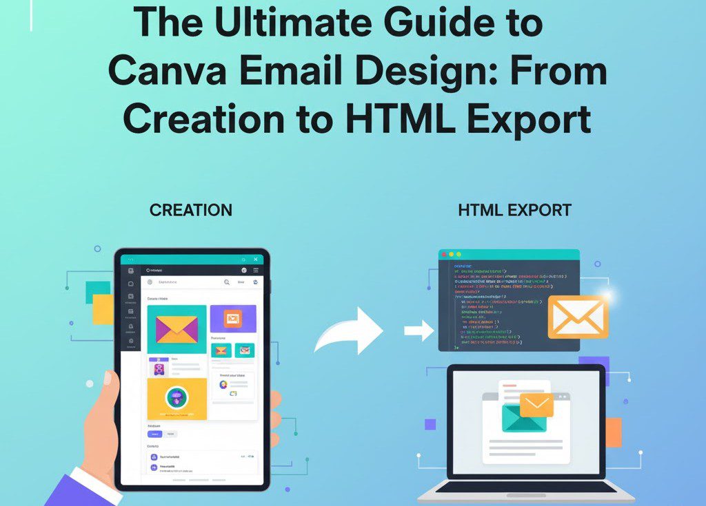
From Design to Deployment: Exporting and Using Your HTML File
This is the most critical—and most commonly misunderstood—part of the process. Your email is beautiful, tested, and ready. Now, how do you get it into your Email Service Provider (ESP) like Mailchimp, Brevo, ConvertKit, or ActiveCampaign?
Click the “Share” button, then “Download.” In the “File type” dropdown, select HTML (Images). Click “Download.”

Canva will package your design and download a ZIP file. When you unzip this file, you will find two key things:
- An
index.htmlfile (or similar). This is your email’s code. - An “Images” folder. This contains all the visual assets from your email, “sliced” and optimized.
You cannot just upload the HTML file and expect it to work. Why? Because the HTML file has code that tells the email to look for the images in a *local folder* on your computer (e.g., src="images/banner.jpg"). When you send that email, your subscribers’ inboxes can’t access your computer’s local folder. Your email will show up with a lot of broken image boxes.
You must host your images online. Here are the two most common ways to handle this.
Method 1: The “Smart Import” (Recommended)
Many modern ESPs understand this problem and have a “smart” import feature.
- Log in to your ESP (e.g., Mailchimp, Brevo, etc.).
- Go to your email templates section and look for an “Import” or “Upload” button.
- You’ll often see an option to “Import HTML” or “Upload ZIP.”
- If it allows you to **upload the entire ZIP file** you downloaded from Canva, choose this option.
- Your ESP will automatically unzip the file, upload the images to its own file manager (its “content delivery network”), and rewrite the HTML code for you so all the image paths are correct.
Method 2: The Manual Upload
If your ESP only allows you to paste in HTML code, you have a few more steps.
- Log in to your ESP and find its “File Manager” or “Content Library.”
- Manually upload all the images from the “Images” folder you got from Canva.
- After you upload each image, your ESP will give you a public URL for that image.
- Open the
index.htmlfile in a simple text editor (like Notepad or TextEdit). - You must “find and replace” every local image path (e.g.,
src="images/banner.jpg") with the new public URL you just got from your ESP (e.g.,src="https://cdn.mailchimp.com/..."). - Once you’ve replaced all the image paths, copy the *entire* block of edited HTML code.
- Go to your ESP’s campaign builder, select the “Custom Code” or “Paste in HTML” option, and paste your code.
This process is technical, but it’s the fundamental step that bridges the gap between Canva’s design tool and the technical requirements of email marketing. Always search your specific ESP’s help documentation for “how to import HTML email” for the exact steps.
Strategic Considerations: Canva vs. Your ESP’s Native Builder
Now that this powerful tool exists, does it mean you should abandon your ESP’s built-in email builder? Not necessarily. The smart marketer knows when to use the right tool for the job.
When to Use Canva for Your Emails:
- For Design-Heavy Campaigns: When the visual “wow” factor is the primary goal. Think brand announcements, new product launches, visual-heavy newsletters, or event invitations.
- For Brand Consistency: If your team already lives in Canva, you can create and share email templates just like any other brand asset, ensuring everyone is using the same approved designs.
- When Your ESP’s Builder is Lacking: If you’re on a platform with a notoriously clunky or limited email builder, Canva can be a permanent replacement for all your design needs.
When to Stick with Your ESP’s Native Builder:
- For Highly Personalized Emails: Native builders are deeply integrated with your subscriber data. This makes it effortless to insert personalization tags (like
*|FNAME|*for a first name) or use complex dynamic content (e.g., “show this block only to subscribers tagged ‘Customer'”). While you *can* add these tags to Canva’s text, it’s a more manual process. - For Simple, Text-Based Emails: Sometimes, a simple, personal-looking text email performs best. Using a complex design tool for this is overkill.
- For A/B Testing: Most ESPs have built-in A/B testing for subject lines, content, and send times. Running these tests is almost always easier and more reliable within the native platform.
Conclusion: Democratizing Beautiful Email
Canva’s email design feature is a revolutionary step in breaking down one of the oldest and most frustrating barriers in digital marketing. It places the power of a professional email designer into the hands of anyone with a creative idea. No longer is the marketing world split between those who can code HTML and those who are stuck with boring templates.
By providing an intuitive design space, integrated AI tools, and a direct-to-HTML export, Canva has built the bridge that was missing between creative vision and technical execution. While the export and import process still requires a small amount of technical awareness, it’s a minor hurdle compared to the mountain of hand-coding that was previously required.
This tool empowers small businesses to compete on a professional level, allows marketers to execute on their ideas faster, and ultimately, makes the internet a more beautiful, engaging place—one inbox at a time. The challenge now shifts from *how* to build it to *what* to build. With design limitations removed, the focus rightfully returns to the core of great marketing: a compelling message, a clear strategy, and a deep understanding of your audience.